 Edited by Parafraz Editors
Editorial team
Published
How to write marketing emails people want to read
A marketing email is read one line at a time, from the sender name to the one thing you ask for. Here is each line, weak and then better, with the reason for every change.
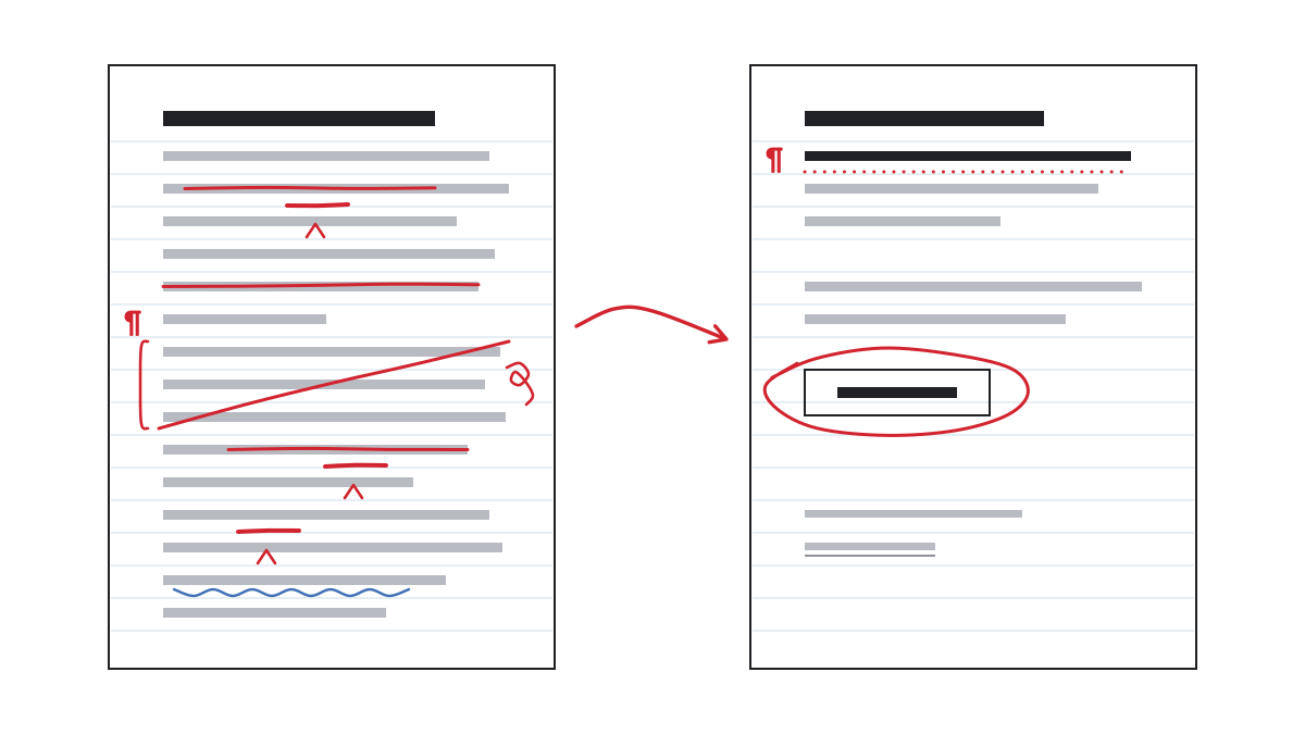
The people on your list asked to hear from you. Every email either keeps that agreement or wears it down. This guide follows an email in the order your reader meets it: a weak line, a better one, and the reason for the change.
Start with what they asked for
The promise you made at sign-up is the brief for every email: what people asked for, and how often. Write it above your draft.
Write only to people who signed up. Many platforms offer a confirmation step, often called double opt-in: the new subscriber gets one email with a link and joins the list only after pressing it, as Mailchimp’s help centre describes. Google’s sender guidelines ask you to confirm each address; Yahoo’s recommend double opt-in.
Yahoo asks senders to set expectations clearly at sign-up. The first email after it repeats the promise.
You are on the list. One email a month, on the first Friday: what is new in the nursery, and one note on plant care. Nothing else.
The three lines they see before they open
Before anyone opens your email, the inbox shows three lines: the sender name, the subject and the preview text. The reader decides on those alone.
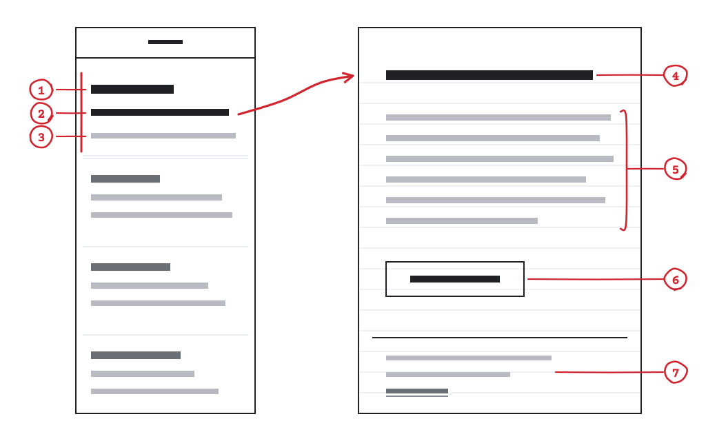
- Sender name
- Subject
- Preview text
- Opening
- Body
- Call to action
- Footer, with the unsubscribe link
Sender name
Use the name people know, the same one every time. Google’s sender guidelines ask that display names only identify the sender.
Hillside Plant Nursery
Subject line
Say what is inside, key words first. A 2014 guideline from Nielsen Norman Group suggests showing no more than 40 characters, with the necessary content at the start so it is not cut off. Mailchimp’s style guide says: tell, don’t sell, what is inside.
New this Saturday: seeded rye and walnut
The table holds four more subject lines, each weak for a different reason.
| Weak | Better | What changed |
|---|---|---|
| Workshop hours change from 1 June | Capitals and exclamation marks are noise. The news is the line. | |
| Six new merino colours, in the shop now | A first name is not a reason to open. What is inside is. | |
| Repotting morning this Saturday, 10:00 | The sender name already says who you are. | |
| The refillable notebooks are back | "Re:" belongs to a real reply. |
Preview text
Preview text is the line beside or below the subject. Leave it empty and most mail apps show the first lines of your email instead, as Litmus explains. Write it as the subject’s second sentence. Both versions below sit under the subject "Repotting morning this Saturday, 10:00".
Bring one plant. We supply the soil, the pots and the bench.
How long each line should be
The table holds what published guides recommend (help pages seen on 13 November 2026). They disagree: these are habits of inboxes, not rules.
| Line | Guidance | Source |
|---|---|---|
| Subject line | no more than 40 characters | Nielsen Norman Group, 2014 |
| Subject line | no more than 9 words and 60 characters | Mailchimp help centre |
| Subject line | no more than 3 punctuation marks and 1 emoji | Mailchimp help centre |
| Preview text | under 90 characters | Litmus, 2024 |
| Preview text | between 30 and 80 characters | Mailchimp |
| Preview text | up to 150 characters | Kit help centre, updated 2 September 2026 |
Open with the point
Put the news in the first sentence. Nielsen Norman Group calls this the inverted pyramid: the most important information first, so a reader who stops anywhere still has the point. Introductions are what people skip. In a 2006 Nielsen Norman Group eyetracking study of 42 people reading newsletters, 67% never once looked at a newsletter’s introduction.
The refillable notebooks are back, in three sizes. Here is what changed in the paper.
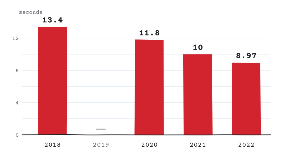
Attention is short. In what Litmus measured, the average time spent reading an email fell from 13.4 seconds in 2018 to 8.97 seconds in 2022. Do not save the point for later.
Cut the body to one idea
One email carries one idea. Have three pieces of news? Lead with the one that matters most to the reader, and save the rest for the next email.
One email, one idea, one action.
People scan. In an early study of web pages by Nielsen Norman Group, from 1997, 79% of test users scanned a new page and 16% read it word by word. Concise text scored 58% higher on measured usability, a scannable layout 47% higher, and neutral rather than promotional language 27% higher. In the 2006 newsletter study, participants read only 19% of the newsletters in full.
Plain words suit expert readers too, as Nielsen Norman Group found in 2017. Give each paragraph one idea, put the conclusion first, and cut every adjective the reader would have to take on trust.
You can now export any report as a spreadsheet. Open the report, choose Export, pick the columns. Three clicks.
Ask for one thing
Ask for one thing, in the words of what happens next. Mailchimp’s style guide says to make the next step clear and to keep only the most important links, which also means fewer wrong taps on a small screen. The W3C’s writing tips advise against link text such as "click here" or "read more".
Book a spring tune-up
Make buttons and links look like what they are. The W3C’s design tips ask for distinct styles for interactive elements, so they are easy to identify.
Write for every reader and every screen
Your email will be read with images off, in dark mode, on a phone, through a screen reader and as plain text. Every version has to work.
Some email apps turn images off by default, Mailchimp’s style guide notes, and words inside a picture go with them. Keep words as text. Give every image alternative text that says what it shows or, for a link, what it does, as the W3C images tutorial advises.
The new seeded rye loaf, sliced, on a wooden board
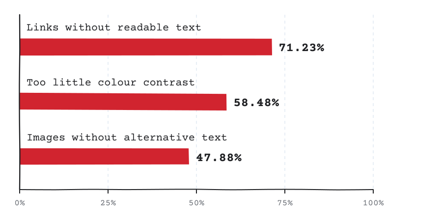
Problems like this are common. For its Accessibility Report 2026, the Email Markup Consortium ran automated checks on 376,348 HTML emails collected from May 2025 to May 2026; 99.88% had at least one problem rated serious or critical.
Give text enough contrast, and never let colour alone carry meaning, as the W3C’s design tips say.
Dark mode works in one of three ways, Litmus explains: some apps leave the email alone, some darken only light backgrounds, some invert every colour. Which app does which changes; your platform’s preview shows it. Litmus counted dark mode in about a third of the opens it could classify in 2022. Do not rely on a dark logo or dark text in a transparent image.
Platforms also generate a plain-text version for mail apps that cannot show HTML; MailerLite’s help centre explains how its version is made. Read yours once: the links should make sense, and the unsubscribe link should be there.
Make leaving easy and keep your rhythm
The footer says who you are, why the reader gets this email and how to stop.
You get this email once a month because you signed up in our shop or on our website. Not for you any more? Unsubscribe.
Put the unsubscribe link in the body, where people can see it. Google’s sender guidelines ask for that, and Yahoo’s say nobody should have to sign in to unsubscribe. The one-click unsubscribe button some mail apps show beside the sender’s name works through a header your platform adds; an open standard from 2017, RFC 8058, defines it.
Your platform and the mailbox providers have their own sender rules. Google and Yahoo publish theirs, and your platform’s help centre explains how it meets them.
Send as often as you said you would. Yahoo’s guidance is plain: do not start sending daily emails to subscribers of a weekly or monthly mailing.
Read your results with care
An email platform such as Mailchimp, Brevo, Kit or MailerLite reports opens, clicks and unsubscribes. Read each with care.
An open is an estimate. Apple’s Mail Privacy Protection downloads an email’s remote content in the background when the message arrives, so an open can be recorded for an email nobody read.
A published average is not a goal. Mailchimp’s averages for all its users, last updated in December 2023 and taken from campaigns sent to at least 1,000 subscribers, are 35.63% of emails opened, 2.62% clicked and 0.22% unsubscribed. That is what one platform measured, not a forecast for your list: results depend on your business and your readers.
Compare an email with your own earlier ones instead. Mailchimp, for one, shows your last five subject lines with their open rates. Then look past the open: clicks on the one thing you asked for, replies and unsubscribes say what readers did.
Check it before you send
Go through the list before every send.
- Would the person who signed up recognise this as what they asked for?
- The sender name is the one they know.
- The subject says what is inside, key words first.
- The preview text is set and adds to the subject.
- The first sentence carries the point.
- One idea, one action, and a button that says what it does.
- Every image has alternative text, and nothing important lives only in a picture.
- It works with images off, in dark mode, on a phone and as plain text.
- The footer says why they get it and how often, and the unsubscribe link works.
- You read it aloud and sent a test to yourself and one other person, as Mailchimp’s style guide suggests.
Four questions come up often.
Should I use the reader’s first name in the subject line?
The sources differ. Nielsen Norman Group’s 2014 guideline advises against it; Mailchimp’s help centre says personalisation increases open rates for most of its users. Try both on your own list.
How long should a marketing email be?
As long as one idea needs. In Nielsen Norman Group’s 2006 study, readers gave a newsletter 51 seconds on average after opening it.
How often should I send?
As often as you said you would when they signed up. To change that, tell your readers first.
Does an emoji in the subject line help?
None of the sources here measures that. Mailchimp’s help centre suggests one at most, supporting words and never replacing them; Nielsen Norman Group advises against starting a subject line with a special character.